- by New Deal democrat
Mike Konczal of the Next New Deal has a post up claiming to show that even the currently employed are struggling to find jobs, and therefore there has been no jobs recovery. Like many Doomish arguments, it suffers from "proving too much." The author finds some metric either flatlining or going down since 2009, therefore conditions are not improving. The author never thinks through the implications of the same data showing the exact same thing for previous economic expansions. That's Konscal's problem here.
Konczal says:
Even those who have been unemployed zero weeks are having trouble finding jobs in this economy. And this is important evidence against the idea that the labor market is doing better than people realize if you just ignore the long-term unemployed.
.... If the economy is heating up significantly and the long-term unemployed aren’t capable of taking jobs, then the EE transition rate should be increasing. So how is it doing?
.... If the economy was heating up and the unemployed or those out of the labor force couldn't take jobs, we would expect this to increaseHere's the graph Konczal uses to support his conclusion:
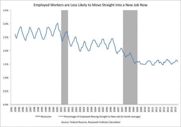
Except here's the problem: the graph just isn't flatlining since 2009 to the present. It also flatlines from 2003 to 2008, and even more tellingly, from 1994 to 1999 - during the biggest economic boom since the 1960s (highlighted below):
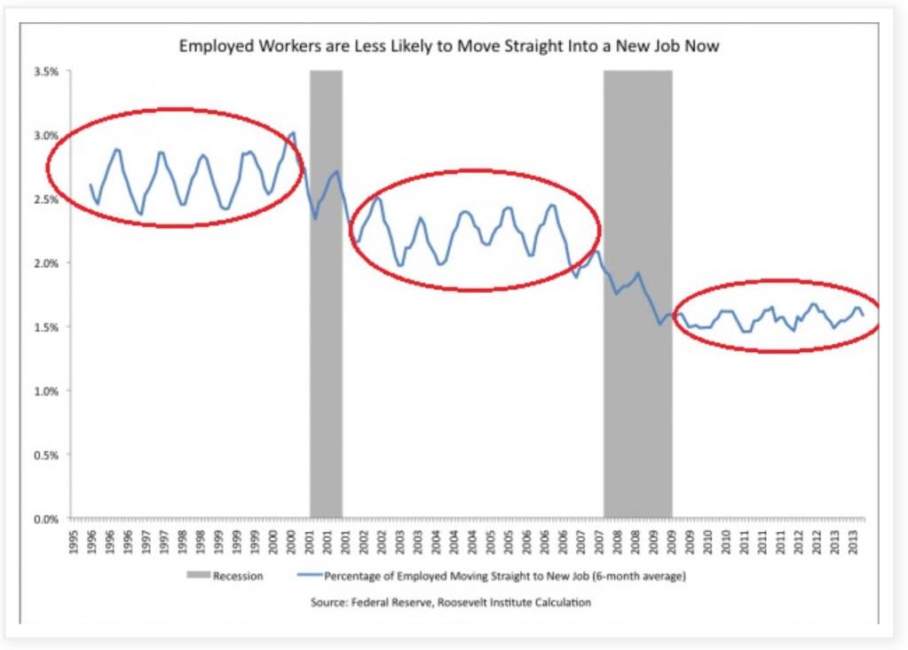
Is Konczal seriously contending that "the labor market wasn't improving" during the biggest boom in the last half century?
The "stair-step down" trend in Konczal's graph reminded me of another, namely, the employment to population ratio. Here is that graph for the same period of time:
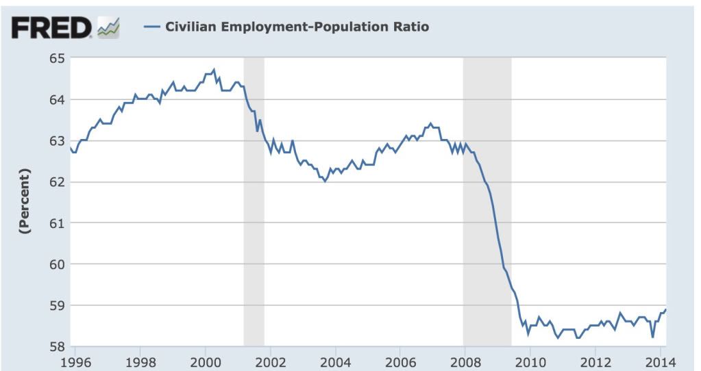
As it turns out, that isn't a coincidence. The Census Bureau also took a detailed look at this data in 2006 (pdf). Here's their graph showing the data up until that point:
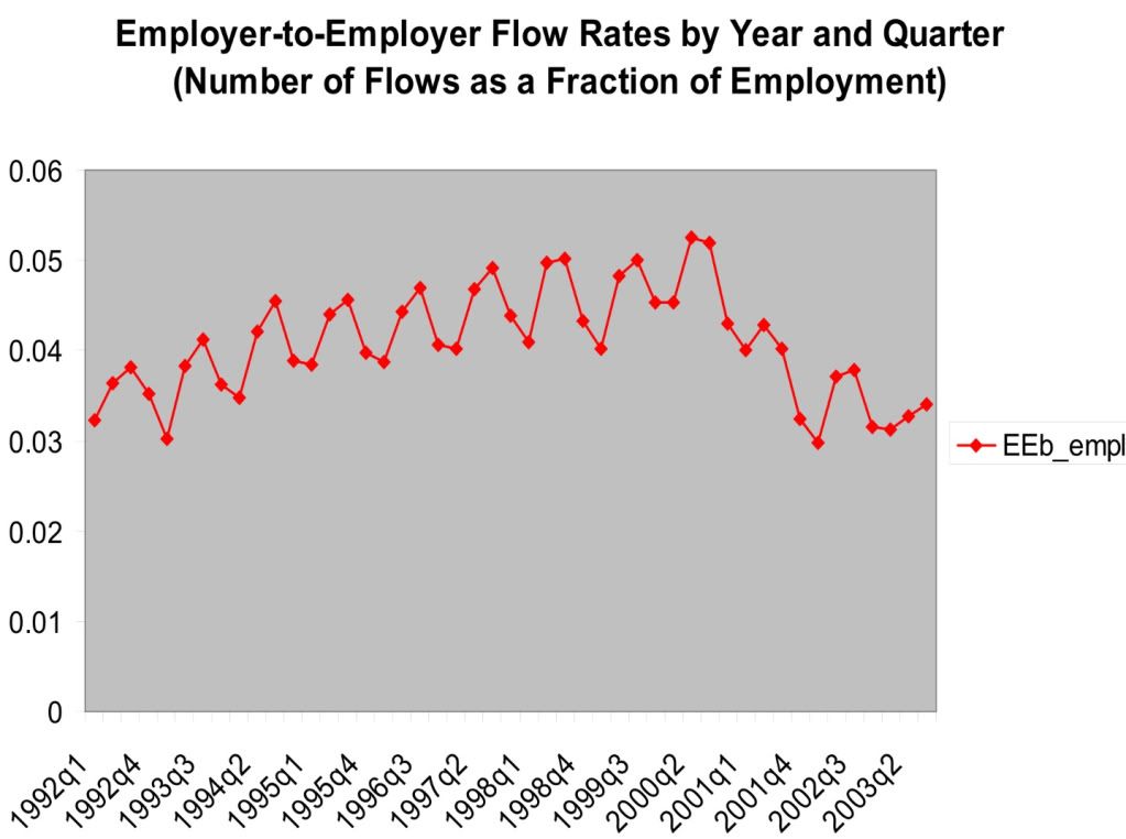
Notice how closely the data tracks the employment to population ratio. Unlike Konczal's graph, the Census Bureau's graph does slightly increase during the mid-1990s. This is likely due to the fact that the two graphs are measuring slightly different things: Konczal's graph measures the "percentage of employed moving straight to a new job" on a 6 month basis, while the Census Bureau's graph measures "number of flows as a fraction of employment" on a quarterly basis.
Konczal's problem is that he entirely fails to take into account the effect of demographics. Here's the Census Bureau's graph showing how employer to employer flows skew by age:
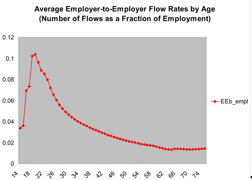
A huge percentage of employer to employer flows comes from people in their 20's. The percentage declines sharply as we move into the 30's and continues to gradually decline thereafter until about age 60.
So what Konczal has failed to account for is the huge distortion in the demographics of the work force caused by young people staying in college longer, and by the Boomer generation skewing the median employment age much higher into the age group that wants nothing more than to hang on to their current job until retirement age.
In other words, Konczal's graph appears to be another manifestation of the employment to population ratio, and not say anything about the relative strength of this job recovery. (My position remains, there has been a jobs recovery, it just hasn't been strong enough.) His data is sound, but his conclusion is faulty because it proves too much.