A month ago I noted the deep difference between the Conference Board's LEI, and ECRI's WLI. The Conference Board has been calling for continued growth in the months ahead, while ECRI has remained steadfast in its recession call. Doug Short has called it The Great Leading Indicator Smackdown. This graph from his blog shows the major divergence between these two leading indicators since late 2008:
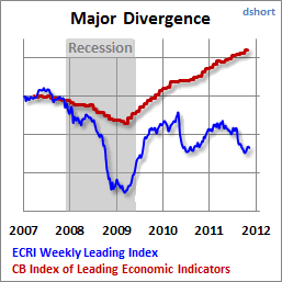
With this morning's LEI of +.5, the schism continues. At least one of these forecasts is wrong, possibly spectacularly so.
The source of the divergence is primarily almost certainly how the two sets of indicators measure bonds. Almost everybody acknowledges that the bond market is an important leading indicator, but in the last 5 years depending on your measure, the nature of that forecast differs markedly.
The Conference Board very transparently states that it is the yield curve -- the difference between long term and short term treasuries -- that it measures. In fact, it is one of the two weightiest elements of the LEI. The yield curve has been relentlessly and substantially positive since late 2007, and is the biggest contributor, along with real M2 and the stock market, to the LEI's almost continuous positivity since spring 2009.
ECRI, of course, uses a "black box", but we know from at least as late as 1992 that its founder, Prof. Geoffrey Moore, considered bond prices generally to be a "long leading indicator," i.e., a measure of how the economy was likely to perform at least 6 to 12 months later. ECRI's current spokesman, Lakshman Achuthan, has specifically indicated in at least one interview that the yield curve, however, is not one of their measures.
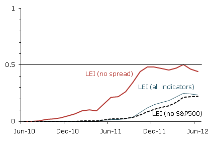
How and whether bonds are measured makes all the difference in forecasts for 2012. The San Francisco Fed (h/t our former co-blogger Invictus) has pointed out that if you remove the yield curve from the LEI, the forecast for late 2011 and early 2012 becomes flat at best (graph measures chances of recession):
But it seems that ECRI goes beyond that and actually does include at least one if not two alternate measures of the bond market in its long leading indicators (USLLI) and/or the WLI: a broad bond index such as the Dow Jones Bond Average or BAA bonds; and credit spreads, i.e., the difference in yields between government and corporate bonds. In fact, as I'll show below it seems all but certain that ECRI does give heavy weight to the latter (credit spreads).
First of all, here is a graph measuring the yield curve (blue, left axis) vs. BAA corporate bonds (red, right axis) and the credit spread (green, right axis) since the beginning of 2006:
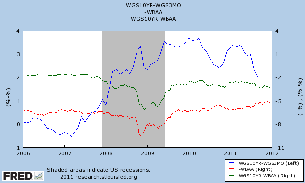
The yield curve inverted in early 2006 and remained inverted until spring 2007, accurately forecasting a recession one year later. Since the end of 2007, however, it has been strongly positive. Contrarily, both corporate bonds and credit spreads were flat going into 2007 and began to deteriorate after April, and reached their nadir in approximately November 2008 (probably not incidentally, ECRI is on record that its USLLI and WLI bottomed at this time).
Here is an alternate view of the same data norming all three measures to 100 at the beginning of 2006:
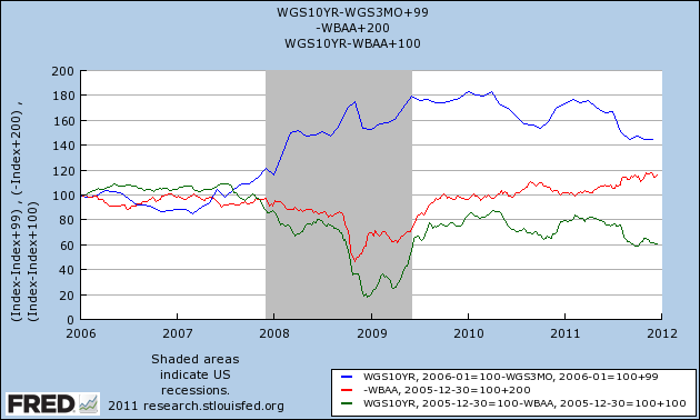
The yield curve remains steadfastly positive, although less so than previously, while BAA bonds (and the DJ Corporate Bond Index, not shown) turned down in late 2010 before turning up again earlier this year. Meanwhile, the credit spread peaked in April 2010 and has been deteriorating almost consistently since then.
Here is a close-up of the same data, beginning in January 2010 (note I've moved the yield curve to the right axis):
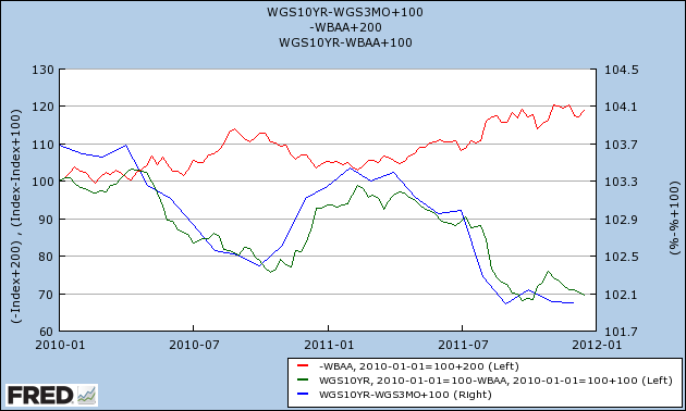
The yield curve remains positive - even though it tracks a similar trajectory to credit spreads. Corporate bond prices as measured by BAA bonds or the DJ Corporate Bond Index have been improving. Only credit spreads continue to deteriorate. They must be one of the important sources of the divergence between ECRI and the LEI.
We'll find out who is right next year. In the meantime, I leave you with the following graph and information. Here is a close-up of a portion of a graph from Ned Davis Research published in early 2008, showing long term government bonds (red) vs. short term government bonds (green):
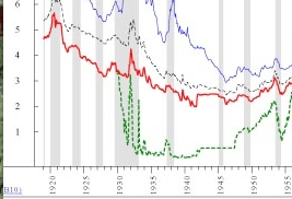
With the near-exception of 1931 as the Fed defended the gold standard, the yield curve never inverted between 1929 and 1954. In other words, bluntly speaking, in times of deflation, a positive yield curve is not terribly predictive.
P. S.: By contrast, an inverted yield curve in the presence of deflation has only happened twice in the last 90 years -- 1928 and 2006-07. Which is why I call it
 the Death Star.
the Death Star.