- by New Deal democrat
You may recall that several weeks ago I looked for data series which turned before April, and were warnings of the deflationary downdraft. Among those were the behavior of bonds vs. stocks, and the Shanghai stock market.
Here is a one year graph of the 10 year treasury vs. stocks. Focus on the last month:
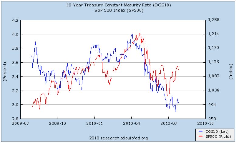
For the first time in 6 months, bonds and stocks are moving in opposite directions. Bond yields have generally continued to decline, while stocks have gone up over 10%. This means that the markets are no longer primarily concerned with deflation, but rather expansion. Note that this pattern mirrors that of a year ago, when the economy started to expand.
Now look at the Shanghai stock index:
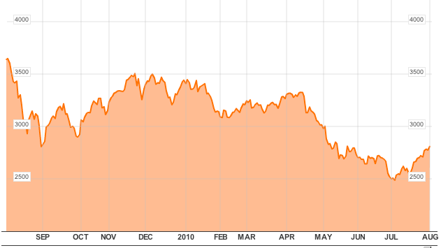
Remember that Shanghai for the last few years has tended to lead Wall Street. This index confirms that the upturn in US stocks is not a fluke.
The other indicators that turned before April included the purchase mortgage index, which may have bottomed several weeks ago. BAA commercial bond yields are now declining again. Oil closed over $80 again yesterday, which is bad news in terms of increased impact on the consumer, but good news in that a drop in demand is not the predominate issue. So far, this is all short term, but the turns in trend are welcome news if they are sustained.
This correlates with what has happened in the real world, in which the April downdraft marked the confluence of the Euro crisis (which has abated), the BP oil catastrophe (which has been capped), the expiration of aid to the states (which may be reinstated this week), the expiration of the $8000 housing credit (the negative reaction to which may have bottomed), and near $90 Oil (which did fall but is now back at $80 again).