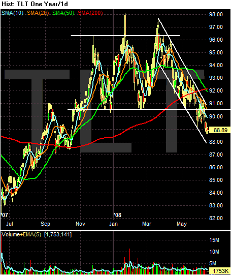
The TLTs consolidated in a rectangular pattern from the beginning of December 2007 to the end of May 2008. Since then they have dropped below the key support level established at the beginning of the consolidation.
The SMA chart gives us a much better picture of what is going on. Notice the following:
-- Prices are below the 200 day SMA
-- The 10, 20 and 50 day SMA have crossed below the 200 day SMA
-- The 10, 20 and 50 day SMA are all heading lower
-- Prices are below all the SMAs
The only positive point to make about the SMAs is the 200 is moving higher. That's it. Everything else is negative.
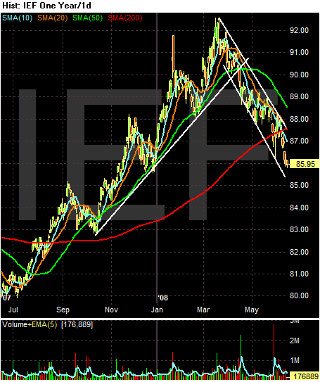
On the 1 year chart of the 7-10 year part of the curve, notice the market caught a huge bid at the beginning of the credit crunch and kept on rally until the beginning of April 2008. Since then the market has clearly been in a sell-off.
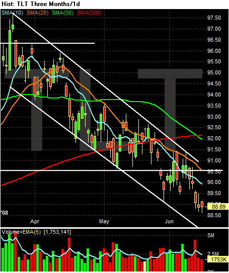
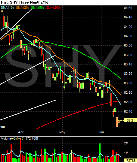
On the three month SMA chart, notice the following:
-- Prices are below all the SMAs
-- The 10 day SMA has moved below the 200 day SMA
-- The 20 day SMA is about to move below the SMA
-- The 10, 20 and 50 day SMA are both moving lower
The only good point on this chart is the 200 day SMA is moving higher. But that's it.
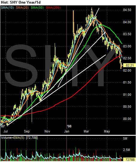
On the one year chart, notice the short-end of the curve had a strong rally since the beginning of the credit crunch. However, they have since sold-off.
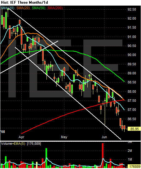
On the SMA charts, notice the following:
-- Prices are below all the SMAs
-- Prices are below the 200 day SMA
-- All the shorter SMAs (10, 20 and 50 day) are heading lower
-- The 10 day SMA has moved below the 200 day SMA
The bottom line is the Treasury market is selling off, largely as a reaction to higher inflation. In addition, we've had numerous statements from government officials that imply rates are going higher.