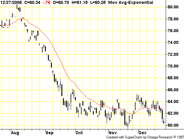
What does this chart tell us? Simple. Supply and demand are near equal. This is a great example of what W.D. Gann would call a distribution pattern. A distribution pattern occurs when a security is at the top of its respective chart or in the middle of a decline and the price starts trading sideways in a trading range. Traders who own the security start to distribute to to willing buyers over a period of time for whatever reason. Here's a monthly chart to show where oil is in the bigger picture.
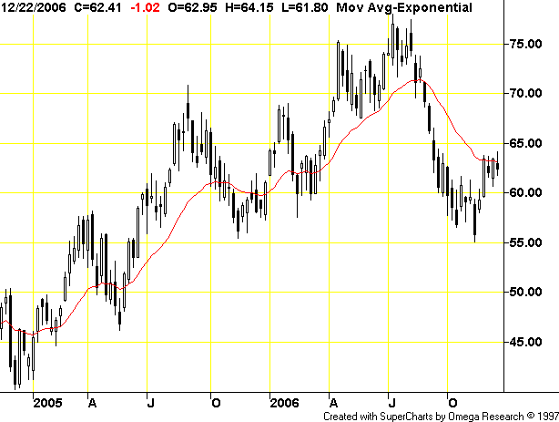
Notice how oil has twice gravitated to the $60/bbl level in the last year -- once in late 2005 when it traded just below $60/bbl and once in the early part of 2006 when oil traded just above $60/bbl. Clearly this is an important price for the oil market.
Oil has clearly broken its long-term uptrend of the last year. Now the question becomes where will oil go from here? Pulling the price down is a mild US winter and slowing US economic growth which lowers overall oil demand. On the up side we still have China growing around 10%, India picking up economic steam and the OPEC production cut. My best guess (and yes it really is just an educated guess) is until the market gets a clearer signal either way it will remain in this range.